Hubert
Hubert
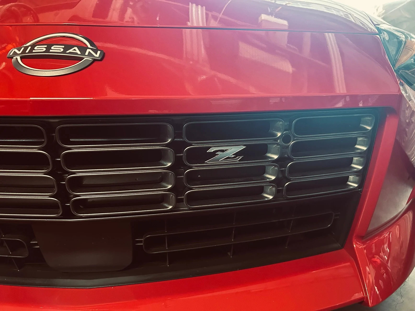
Yes, this is my sentiment as well. I still think the centered placement of the NISMO logo on the rear was a poor choice.Way too many Z logos. I prefer Nissan logo on the front and the back. If there is Z logo on the front and the back, side logos are over kill. I think if Z logo was much larger with slightly different circle around it, it would look way better. When all Z logos are exactly the same including size it will look ridiculous.
 and "what's a Fairlady?" I get those double takes and stares sometimes on the road, golden!!